On this page
- A palette is a system, not a list
- Build colour roles instead of a flat list
- Jewel tones remain useful
- Saturated brights create social impact
- Muted florals and softened tones serve romantic occasions
- Approve colour as a production system
- Where this reading comes from
- The role and control matrix
- Practical buyer worksheet
- FAQ
- Next step
This is written for fashion brands, retailers and buyers planning an occasionwear palette for 2027. It sits inside the same cycle our prom, bridesmaid, eveningwear and wedding guest reports read, and it answers the question none of them owns: given those directions, what palette can this range actually carry? The category is on our occasionwear manufacturing page.
A palette is a system, not a list
A shade enters a range through four gates: it has to suit a role the range needs, it has to be available in the materials the styles use, it has to be reproducible across lots, and it has to be approvable against a physical standard. A shade that passes three of those and fails the fourth does not belong in a range, however current it is.
Where palettes usually go wrong
Three habits account for most palettes that look right on paper and fail in production. The first is building the palette from imagery rather than from availability, so the range commits to shades the mills do not carry in depth. The second is approving each shade on a swatch in isolation, which passes every individual check and still produces an outfit whose lining reads a shade away from its shell. The third is treating continuity shades as a leftover rather than a commitment, so the shade carried forward from last season is the one nobody secured a supply of.
The correction for all three is the same discipline applied at a different moment: check availability before the range is bought, approve the components as a set rather than one at a time, and place continuity shades under the strictest material plan rather than the loosest. Each of those is a conversation with a supplier rather than a decision taken in a design meeting, which is why palettes discussed only internally tend to contain one shade the order cannot deliver.
The four gates
| Gate | The question | What failing it costs |
|---|---|---|
| Role | Which part of the range does this shade carry — core, fashion, statement, continuity? | A shade that carries nothing, using a slot a working colour could have had |
| Material availability | Does it exist in the shell, lining, mesh and trims the styles need? | An outfit in one material and a near-match in another |
| Reproducibility | Can it be bought again, on the same ground, to the same result? | A reorder that does not match the original |
| Approval | Is there a physical standard and a code, approved under stated lighting? | A dispute settled by memory, and a bulk lot that differs from the sample |
Why a long list fails
Each additional colour costs more than the fabric it uses. It multiplies shade approvals, trim matching, cutting sequences and left-over material, and on a small occasion order it fragments every per-shade minimum at once. A palette that has been reduced to the shades that do a job is not a compromise on range: it concentrates the buying power on the shades the range actually sells, and it makes a reorder on the winning shade possible rather than theoretical.
Build colour roles instead of a flat list
The role structure below is the one that works across occasionwear, because it answers the three questions a range has to answer with colour: what does everyone buy, what does the season look like, and what is carried forward.
The four roles
- Core: shades that appear across several styles and carry the volume, expected to sell in every size and to be reorderable.
- Seasonal fashion: the shades that carry the imagery and the season's identity, carried on a smaller number of styles.
- Statement: a very small number of shades placed on hero silhouettes, where the colour is part of the product's reason to exist.
- Continuity: carried forward from the previous season, and therefore the group with the strictest material and dye-lot planning.
How many of each
The proportion matters more than the total. A working occasionwear palette is usually weighted towards core, with one or two shades in the statement group and a continuity range that is deliberately small because each continuity shade is a sourcing commitment across seasons. A palette that is mostly seasonal fashion looks current in the look book and performs badly at reorder, because none of its shades can be easily repeated.
Assign a shade to a role before a style
The order of the decision is what makes the structure work. A shade assigned to core is then placed on the styles that can use it across the range; a shade assigned to statement is placed on the one or two silhouettes that can carry it. Doing it the other way round — choosing a colour per style and then looking for a palette — produces a range with fifteen colours, each on one dress, and no reorderable option at all.
Jewel tones remain useful
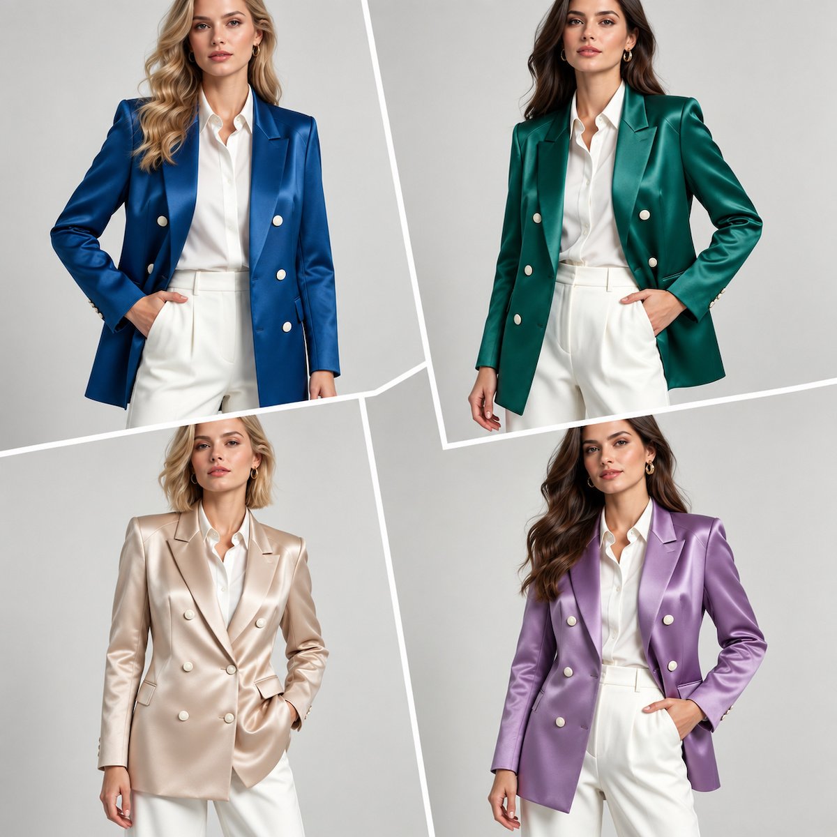
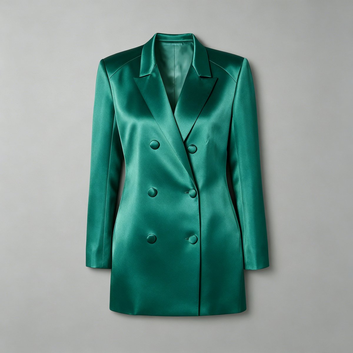
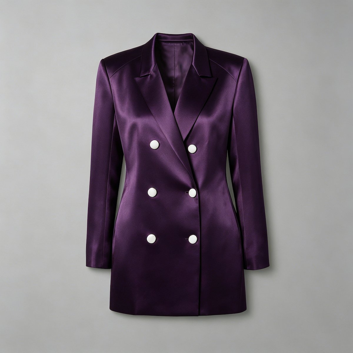
Deep saturated shades — emerald, plum, burgundy, deep blue — are a persistent part of occasionwear for reasons that are commercial rather than cyclical. They read as premium on a good material, they work across the price architecture, and they carry formality without needing decoration.
Why they work on premium fabrics
A deep saturated colour depends on the material's ability to hold depth, so it looks best on the fabrics that already cost more: a heavy satin, a substantial crepe, a velvet, a dense jacquard. That is a useful property in a range because it lets one colour family serve the upper tiers without a change of palette, and it means the jewel group is naturally aligned with the styles that carry the range's best construction.
What deep colours hide, and reveal
A dark saturated shade conceals some opacity problems, which is a genuine advantage on a pale-skin-risk garment, and it reveals others: lint, surface marks, needle damage and press shine all show more clearly on a dark ground than on a mid-tone. It also compresses the visible difference between adjacent dye lots, which makes a shade mismatch harder to catch at approval and more visible once the garment is assembled. The control is to approve shade on the assembled panels rather than on flat swatches, which is the same discipline our lining guide sets out for the optical stack.
Coordinate the components
A deep shade has to be matched across the shell, the lining, any mesh, the cups, the zipper tape and the thread. Each of those is supplied by a different party and each has its own tolerance, so a deep shade requires more matching work than a light one, not less. Where a style uses a contrast lining or a mesh panel, the pairing is part of the shade's specification and should be approved as a pair rather than as two independent colours.
Saturated brights create social impact
Strong pink, yellow and green are a persistent part of the occasionwear picture, and the current cycle supports them: reported runway colour for Summer 2027 places bright yellow, pink and green against a palette of greys and beiges, so the brights are working as accents against restraint rather than as an entire season.
What brights are for
A bright earns its place on the styles a customer chooses in order to be seen, and in the channels where being seen is the point. That is a smaller part of a range than it looks like in imagery, and it is usually best served by placing brights on a small number of silhouettes that already carry a strong shape — a bright on a plain familiar dress is a colour, and the same bright on a defined silhouette is a product. This is the same concentration logic the eveningwear report applies to surface work.
The two tests brights fail
Fastness and cross-material matching. A saturated bright is harder to keep stable through washing and light, and it is harder to match across materials, so a shell, a lining and a trim in the same bright can arrive visibly different from one another. Both are testable before the range commits: a fastness test on the actual ground, and a matched-set approval across every component. Where a bright cannot pass both, the honest options are to carry it in fewer components — a solid dress rather than a dress with trim and lining in the same shade — or to move it to the statement group where the volume is small enough to inspect properly.
Do not spread a custom-dye bright
A custom-dyed bright usually carries a dye-lot minimum, and spreading it thinly across many slow styles converts one minimum into several small commitments with poor sell-through. The commercially sound placement is the opposite: keep a custom-dyed shade on a small number of styles where it can be sold in depth, and use a stock shade from a similar family where the range wants breadth. This is the same constraint arithmetic that governs minimums across the category, which our MOQ guide sets out in full.
Muted florals and softened tones serve romantic occasions
The current cycle carries a quieter strand alongside the brights: muted and ditsy floral patterns, softened tones, and embroidered motifs in shades such as mimosa and lavender. Reported coverage of the Summer 2027 runway places those motifs on tailored pieces, which is a useful signal — a soft colour is being treated as a material rather than as a seasonal mood.
Translate the signal through your own identity
A softened tone can be carried as a solid, as a print, or as embroidery, and the choice is a brand decision. A solid in a muted shade is the most flexible and the easiest to reorder; a print carries more identity and more consumption risk, because scale affects how much fabric a garment uses and whether the pattern has to be matched across seams; embroidery carries the most perceived value and the least flexibility, because its colour is set by the thread and its placement by the frame. Which of the three a brand uses should follow from what it already does well, not from which one the trend coverage shows.
Avoid literal wedding stereotypes
Softness in a bridal-adjacent category invites the range towards the most literal reading of romance, and that reading has a narrow market and a dating problem. The translation that survives is a softened tone on a considered silhouette, with the softness carried in the material rather than in decoration: a muted shade on a clean shape, a textured ground rather than a printed one, an embroidered detail placed where the eye rests. The test is whether the dress would still sell to a customer who had not been thinking about weddings at all.
Use texture when colour is quiet
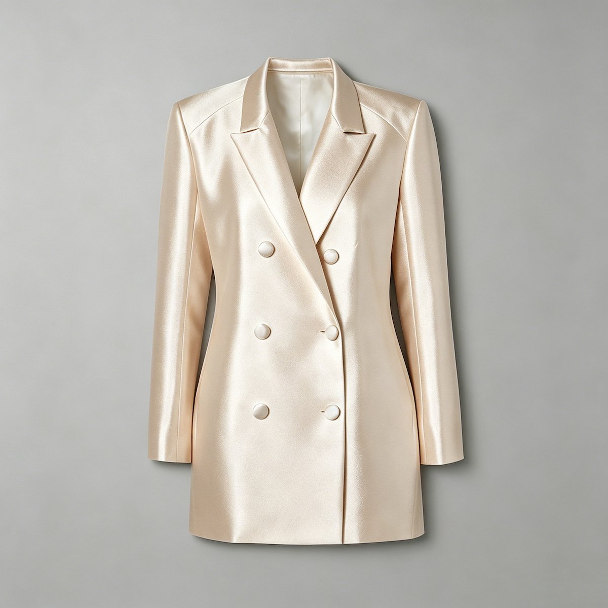
A quiet palette gives up the differentiation that colour provides, and texture is what replaces it. A textured ground, a matte against a satin, a tonal embroidery or a woven structure all provide variation that survives close inspection, which matters in a category where the customer sees the garment in the hand before she sees it on. This is also the cheaper route: texture in the fabric is a sourcing decision, while texture applied as embellishment is a labour one.
Approve colour as a production system
This is where a palette stops being creative direction and becomes an order file. Every shade in the range needs the same three things: a physical standard, a recorded code, and a documented light.
The four controls
- A physical retained standard per shade, kept for the life of the colour and, for continuity shades, across seasons.
- A supplier and article code per material, recorded against the shade rather than held informally by the buyer.
- A stated approval light, so that a later comparison happens under the same conditions it was approved in.
- A dye-lot note per delivery, so a shade difference can be traced to a lot rather than attributed to a supplier.
Review the components together
Shell, lining, mesh, cups, trims and thread have to be reviewed as a set for every shade, because the failures in this article are all cross-component failures. A palette approved swatch by swatch will pass every individual check and still produce a garment whose lining reads a shade away from its shell. Reviewing the set takes one meeting per shade and removes the class of fault that is hardest to correct after cutting.
Keep the approval light consistent
Two people can look at the same two swatches under different light and reach opposite conclusions in good faith. A stated approval light — daylight, a defined interior condition, or both in a stated order — turns the disagreement into a procedure. Where a shade is unusually sensitive, such as a metallic coating or a shade with a strong surface reflectivity, one additional condition is worth adding: the direct flash test the customer's camera will produce, because that is where the customer will see the dress first.
Where this reading comes from
The directions above are dated claims about the world, so the basis is stated rather than implied.
What was checked
The client's content document supplied two editorial references. The Reuters item was located and verified: Helen Reid's report of the Burberry Summer 2027 show, staged in London on 21 September 2026, which states the embroidered mimosa and lavender motif, the range from muted ditsy florals to clashing stripes, and bright yellow, pink and green cutting through a palette of greys and beiges. That is the specific basis for the softened-floral strand and for the brights-as-accents reading in this article, and it is cited below. The generic Vogue seasonal item could not be located in any form and is not cited.
How the directions were corroborated
| Basis | What it tells you | How much weight it carries |
|---|---|---|
| The runway cycle and its colour reporting | Colour is the most reliably reported part of a seasonal cycle, and a direction appearing across several collections is a real movement | Strong for direction and palette structure; silent on quantity |
| Published seasonal colour references | A common vocabulary for a season, used by mills and suppliers as well as brands | Useful as a shared language; not a substitute for a shade you can buy |
| Your own sell-through by shade | The only basis for deciding how much of a colour to buy | Decisive — two brands can carry the same direction in very different depths |
How to keep the reading current
The show cycle runs twice a year with Spring/Summer reported from September, and mills commit to their seasonal colour ranges on a similar rhythm, which means the window to influence what can be bought closes earlier than the window to influence what is designed. The practical sequence is to read the cycle before the palette is fixed, to confirm availability with the mills before the range is bought, and to review the palette against sell-through at the end of each season. A palette reviewed only at the design stage will contain shades the range cannot source in depth.
The role and control matrix
The working version of this article. Each role brings a sourcing requirement and a control with it, and the control column is what makes the palette a document rather than an intention.
| Role | Where it belongs in the range | Sourcing requirement | Control |
|---|---|---|---|
| Core | Across several styles, in depth, every size | Stock shades on stock grounds, so no dye-lot minimum stands in the way | Physical standard per shade; reorder test before the shade is confirmed |
| Seasonal fashion | On the styles that carry the season's imagery | Available in the shell and lining the styles use, and in the trims | Cross-component approval as a set |
| Statement | On one or two hero silhouettes, in small depth | May justify a custom dye, because the volume is concentrated | Dye-lot note per delivery; fastness test on the actual ground |
| Continuity | Carried from the previous season, on the styles it suits | The strictest requirement, because the shade has to be repeatable | Retained standard across seasons, plus a supplier code recorded per material |
The shade count decision
Use the smallest palette that produces a complete commercial story, and test the answer by asking what each shade is for. A shade that cannot be given a role, a style group and a reorder plan is a shade that will consume a minimum, an approval and a cutting sequence in exchange for a small and unrepeatable sale. On a small occasion order the same arithmetic decides the whole range, which is why palette discipline and minimum management are the same conversation.
What a palette costs to hold
A colour is not a free addition to a range. Each one carries a set of costs that never appear on the fabric invoice, and seeing them together is what makes the case for a smaller palette concrete rather than aesthetic.
| What a colour adds | Where the cost lands | How it behaves as the count rises |
|---|---|---|
| A fabric and lining booking | Material purchasing | Falls per shade with volume, which is why eight shades on one order costs more than four |
| A shade approval, per lot | Development time | Rises faster than the colour count, because a shade that sells well runs over more than one lot |
| A trim and thread match | Sourcing and inspection | Adds a matching problem per component rather than per dress |
| A cutting sequence | Production time | Adds a setup to the line for every shade change |
| Left-over material | Working capital | Concentrates on the shades that sold least, which is the worst place to hold stock |
Practical buyer worksheet
Fill this in before the palette is fixed. For a colour programme the sixth line is the one that decides cost: a stated colour count is what stops a role structure from becoming a list.
- Target customer and use occasion
- Target retail and wholesale price
- Target ex-factory or landed cost
- Core fabric and backup fabric
- Size range and base fit size
- Colour count and continuity colours
- Critical construction risks
- Approval sample required
- Inspection checkpoints
- Latest acceptable delivery date
FAQ
What colours will matter in 2027?
The current signals show a broad mix rather than one dominant shade: jewel tones in deeper saturations, saturated brights placed as accents against restrained neutrals, burgundy and plum as bridge shades, softened florals and muted tones for the romantic strand, and modern neutrals carrying the volume. That is a palette of roles rather than a colour of the season, and it is the more useful reading — a season with a single dominant colour is easy to follow and easy to be wrong about, while a season with four working strands lets a range choose the one its customer will actually buy.
How many colours should a brand launch?
The smallest number that produces a complete commercial story. Practically, that means enough core shades to cover the styles and sizes the range depends on, one or two seasonal shades to carry the imagery, a very small statement group, and a continuity range sized to the shades that actually sold. The number matters less than the roles being filled: a range with eight shades and clear roles will outperform a range with fifteen shades where each dress has its own colour, because the first can be reordered and the second cannot.
Why do colours look different in photographs?
Because the photograph records light reflected from the surface, and the surface behaviour of a shade changes with lighting, sheen, flash, the lining behind it and the colours around it. A satin and a crepe in the same shade can photograph as different colours; a shade over a contrast lining is not the same colour as the same shade over a matched one; and a coated or metallic surface changes most of all under direct flash. This is why the approval should happen on the assembled garment under a stated light, and why a shade approved from a digital image is not approved at all.
How should reorders be controlled?
With physical standards, supplier codes and a dye-lot comparison rather than digital swatches. A reorder is where colour control is actually tested, because the original lot is finished and the new one is dyed separately. Keeping a retained physical standard, recording the supplier and article code for every material in the stack, and comparing the new delivery against the standard under the light it was approved in turns a reorder from a hope into a check. For continuity shades carried across seasons, that standard has to be kept for as long as the shade is sold.
Next step
We develop and produce occasionwear at our production facilities in Guangzhou and Dongguan, with stock and made-to-order colour sourcing, shade approvals on assembled components under a stated light, coordinated shell, lining, mesh, trim and thread matching, dye-lot traceability, and retained physical standards for reorder colours. Send the palette you are considering and the materials you intend to use, and we will come back with what can be sourced in depth, what needs a custom dye, and what role each shade is actually filling. Request a quote, or see how we run the category on our occasionwear manufacturing page.
Our MOQ guide covers how a custom dye lot becomes the binding constraint on a small order, and wedding guest dress trends 2027 covers the dress-code structure a palette has to serve. Silhouettes already in production are on our style library and ready stock pages, and the wider category is on the women's dresses page.